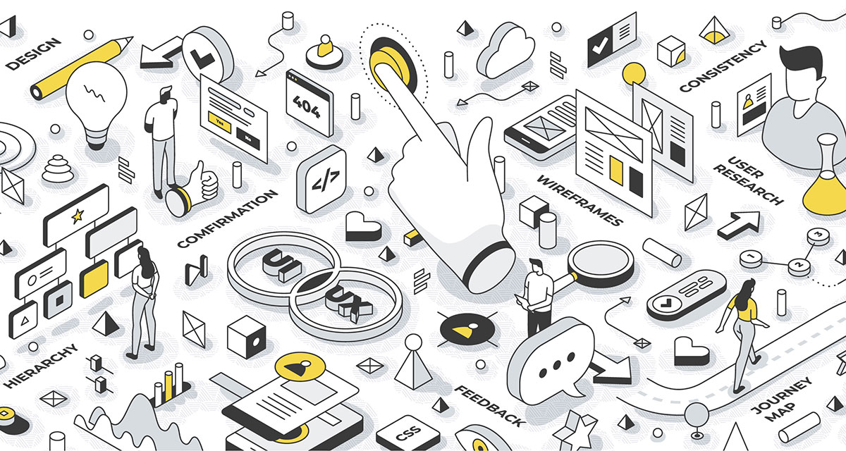
Trends
How it looks vs. how it works
In digital design, there shouldn't be any conflict between how good something looks and how well it works. A top-quality user experience delivers on a number of consistent elements: It’s easy to use, it's fast and it's convenient.
In a time of high expectation and super-fast commerce, convenience is king. In the long run, 'easy' beats 'better.'
It's all too common to hear how confused and frustrated people get when dropping out and abandoning a typical web task part of the way through. If it feels like too much work, then it probably is.
So, designing for your target audience(s) needs and wants is the key to any well considered and successful user experience.
Top five pain points
Our UX design team has collectively encountered countless design ‘pain points’ across a diverse range of industry dilemmas. Here’s our top five – with a few thoughts on how to fix them.
1. Confusing navigation
A site or app's vague navigation lacks clarity, which often results in people struggling to understand where they need to go next.
Poor signposting often results in mis-clicks and mis-steps from the start.
First impressions are crucial. To solve this, the main navigation should quickly communicate the role and purpose of your experience from the outset. People should be able to easily scan your main navigation, encouraging them to find what they need using clear signposting.
2. Vague calls-to-action
Confusing button labels often lead to hesitation and confusion. Hesitation is a key part of drop-outs, and unclear buttons are a key factor.
It's essential that your calls-to-action are as clear as possible. Your customers should always know what to expect whenever they click a button or a link.
A consistent, learnable experience always gives people an understanding about where they are and where they need to go next.
Success story
We cut user journey interactions by 50%, delivering a 12% increase in online bookings for a well known high-street restaurant chain.
3. Dead-ends
Dead-ends, or missing next steps at the end of a screen or page can cause delays in interaction and confusion.
Don't make people think about what’s next – provide an easy next step or action.
Use timely and relevant actions to guide and nudge people into their next step.
4. Dense interfaces
Overly dense or cluttered user interfaces can create unnecessary delays for users. If your experience looks complicated and feels confusing, it probably is.
Don't count clicks – measure the time taken to complete a task. Ease the expectation on the user by grouping information into separate steps and actions.
Success story
A complete homepage UX transformation increased software subscription sign ups by 11% for a B2B fintech business.
5. Missing feedback
Unclear and vague interfaces often lack clear and timely feedback, which can disorientate and confuse the user.
When people interact or perform an action, your experience should confirm what’s just happen – and tell them what they need to do next.
The expectation economy
Customers often judge a website, app or ordering experience against the one we’ve just used, or perhaps one of their favourites. And we often see people comparing digital experiences against mobile-first products and services. This comparison is known as the Expectation Economy.
With the continued rise in the popularity of experiences optimised for mobile that are entirely focused on convenience, it’s never been more vital to create a good user experience.

